Design Examples for Digital - TNWR
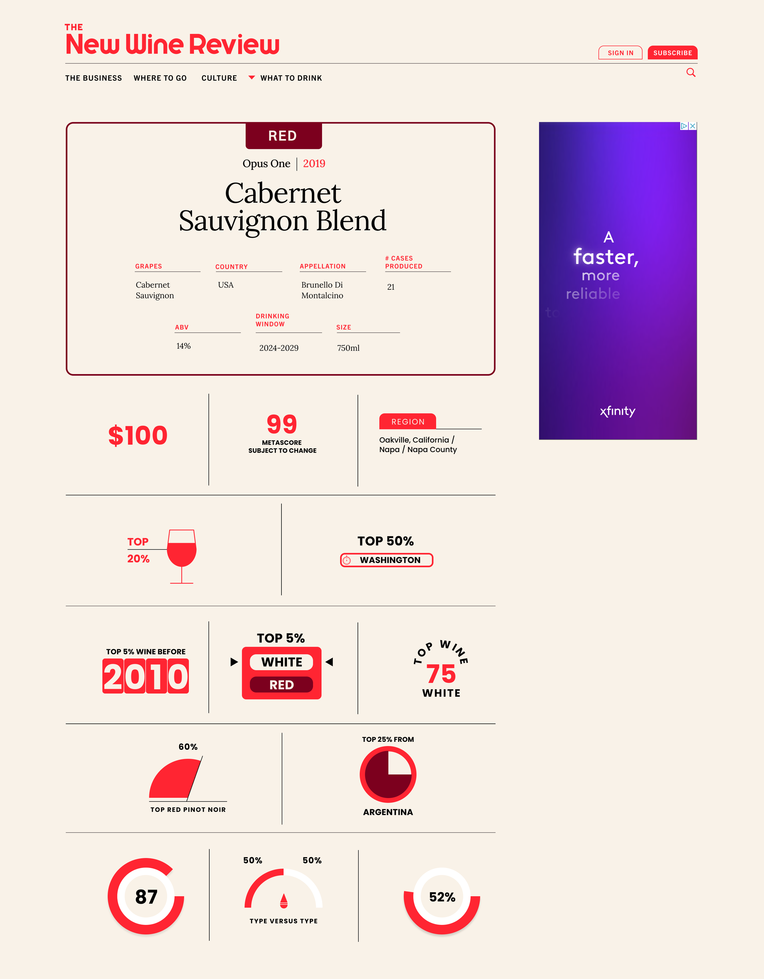
For this project, I was tasked with creating multiple icons, badges, and functional widgets for the New Wine Review website. This project is has not gone live yet, so this link has limited availability. Working with the marketing director, this project was built within Figma and then delivered to a developer to help finalize the projects.
Icon Badge Design + Layout Design - TNWR
For the icons, I used Figma to build all the assets and then used the data provided to from TNW to help fill the icons with their assigned data. With this process, I took the data and tried to find icons that best matched the look and feel of what was being presented.
Widget Design + Layout Design - TNWR
In addition to the icons, I was tasked with creating widgets using various algorithms to display the data and the widget itself. In addition to creating the widgets, I also needed to create the layout for how these items would be displayed on the site. This process also included a back and forth with the team to make sure the data and widgets were logical.
Alternative Layout Design - TNWR
One big request for this project to was also experiment with a different layout for the widgets. I used this version of the layout to help simplify the information regarding the project and to clean the layout for multipurpose display across all devices.


